Step-by-Step Tutorial on Creating a Professional Header with Elementor in WordPress

The header is the first section visitors see when they enter your website. A well-designed, professional header can introduce your brand, simplify navigation, and increase user retention.
In this tutorial, we’ll use Elementor Pro to create a responsive and stylish header — all without writing a single line of code.

Step 1: Access the Theme Builder

To create a header in Elementor, you need to use the Theme Builder section.

  1. Go to your WordPress Dashboard.

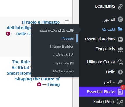
  2. From the left-hand menu, navigate to: Elementor → Theme Builder.

  3. Click on the Header option.

  4. Then select Add New Header to start creating a new one.

مسیر ورود به Theme Builder در المنتور

💡 Tip: You must have the Elementor Pro version installed to access this section.

Step 2: Choose a Ready-Made Template or Start from Scratch

After clicking “Add New Header”, Elementor will display several ready-made header templates.
At this stage, you have two options:

  • Use a pre-designed template (quick and easy)

  • Design from scratch (fully customizable and unique)

For a custom design:

  1. Click on the “+” icon.

  2. Choose a three-column structure (Logo / Menu / Button).

Step 3: Add the Logo and Navigation Menu

You now have three columns. It’s time to fill each one with content:

  • In the left column, drag and drop the Site Logo widget.
    → This element automatically displays the logo set in your WordPress settings.

  • In the middle column, add the Nav Menu widget.
    → From the panel on the left, choose the menu you want to display.

  • In the right column, add a Button widget.
    → Set its text to something like “Contact Us” or “Get Started.”

Step 4: Customize the Header Style and Appearance

Elementor offers powerful styling options to customize your header design:

  • Change the header background color:
    Go to Style → Background → Color

  • Add a shadow under the header:
    Use the Box Shadow option.

  • Adjust spacing and margins:
    Use Padding and Margin to properly align and organize sections.

  • Change menu font and typography:
    Under the Nav Menu → Typography tab, customize font family, size, and weight.

💡 SEO Tip: Include only important pages (e.g., Home, Services, Blog, Contact) in your header menu — this helps Google better understand your site structure.

Step 5: Make the Header Responsive (Responsive Design)

Today, over 70% of users visit websites using their mobile devices — so your header must be fully responsive.

To test and adjust responsiveness in Elementor:

  1. At the bottom of the editor, click the Responsive Mode icon.

  2. Switch between Desktop, Tablet, and Mobile views.

  3. In Mobile view, set the navigation to a Hamburger Menu for better usability.

  4. Adjust font sizes and button dimensions for mobile to ensure they’re easy to tap and read.

Step 6: Enable the Sticky Header Effect

If you want the header to remain visible at the top of the page while scrolling, follow these steps:

  1. Click on the header section to open its settings.

  2. Go to Advanced → Motion Effects and enable Sticky → Top.

  3. (Optional) Turn on “On Scroll Up” — this makes the header appear only when the user scrolls upward.

Step 7: Set Display Conditions

In the final step, you’ll define where your header will appear on the site:

  1. Click the arrow next to the “Publish” button.

  2. Select Display Conditions.

  3. To show the header across your entire website, choose Entire Site.

  4. Finally, click Save & Close to apply your settings.

Step 8: Pro Tips for Designing a More Attractive Header

🔹 Use colors that match your logo and brand identity.
🔹 Keep the header height minimal so users can quickly see your main content.
🔹 Choose a clean and readable font for better user experience.
🔹 Place social media icons in one corner of the header for easy access.
🔹 For the mobile version, center the logo and button to ensure a balanced layout.

Conclusion

By following these steps, you’ve successfully created a professional, responsive, and attractive header for your WordPress website — without writing a single line of code.

With its intuitive interface and powerful features, Elementor is the perfect tool for both beginner and professional designers.

📢 HAMWebsite Recommendation:

If you’re using Elementor for the first time, we recommend starting with pre-designed templates. Then, gradually customize colors, fonts, and menus to gain full control over your design skills.